For Project Risk, I was asked to create creative outcomes that responded to the themes of people, places, still life and landscapes and we were asked to create more individual pieces rather than just observations.
Caricatures


I decided to look at caricatures and look at distorting the facial features to create a cartoon style and yet still keep the likeness of the individual. I am particularly pleased overall with the self portrait shown above and feel it resembles both the image of myself shown above the caricature style well.


The two pieces here were experiments looking at adding and removing surfaces and the way in which this could exaggerate a persons face, for the left piece, the surface was removed and marks were made into paint to create details whereas the right sample was more about adding paint and newspaper to create a more collaged piece, these were both made using the sample below as reference.

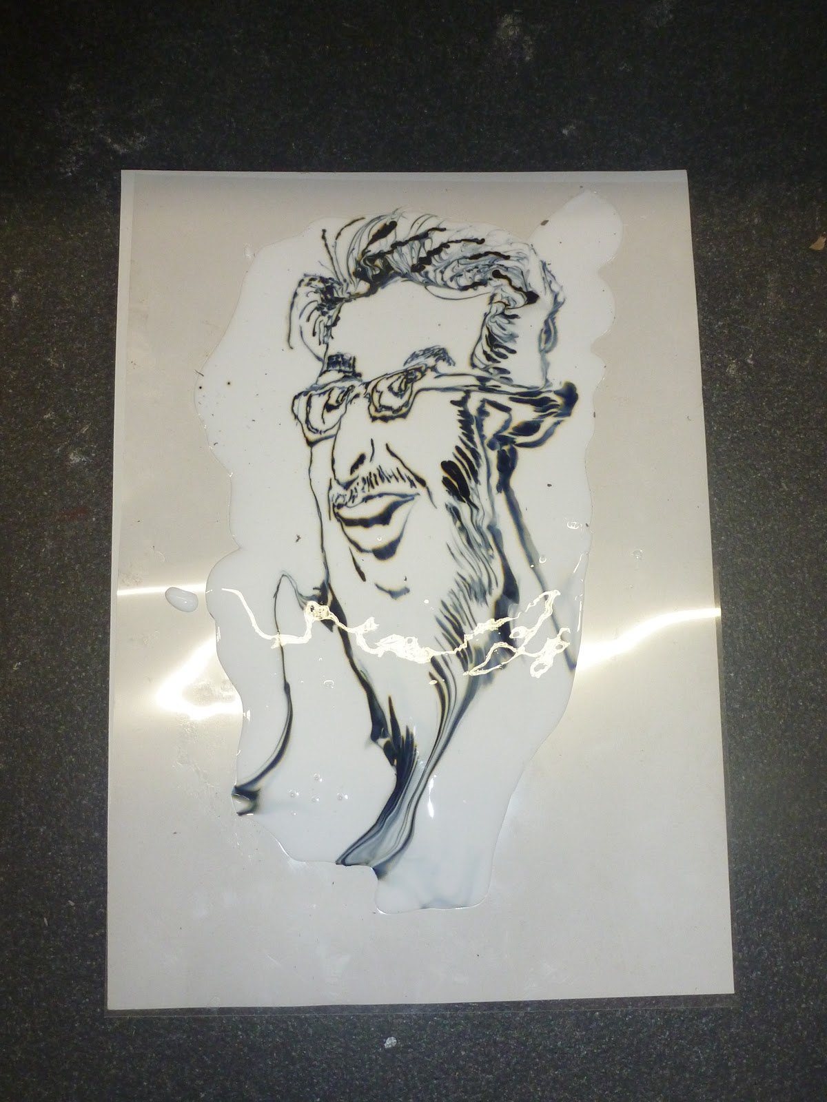
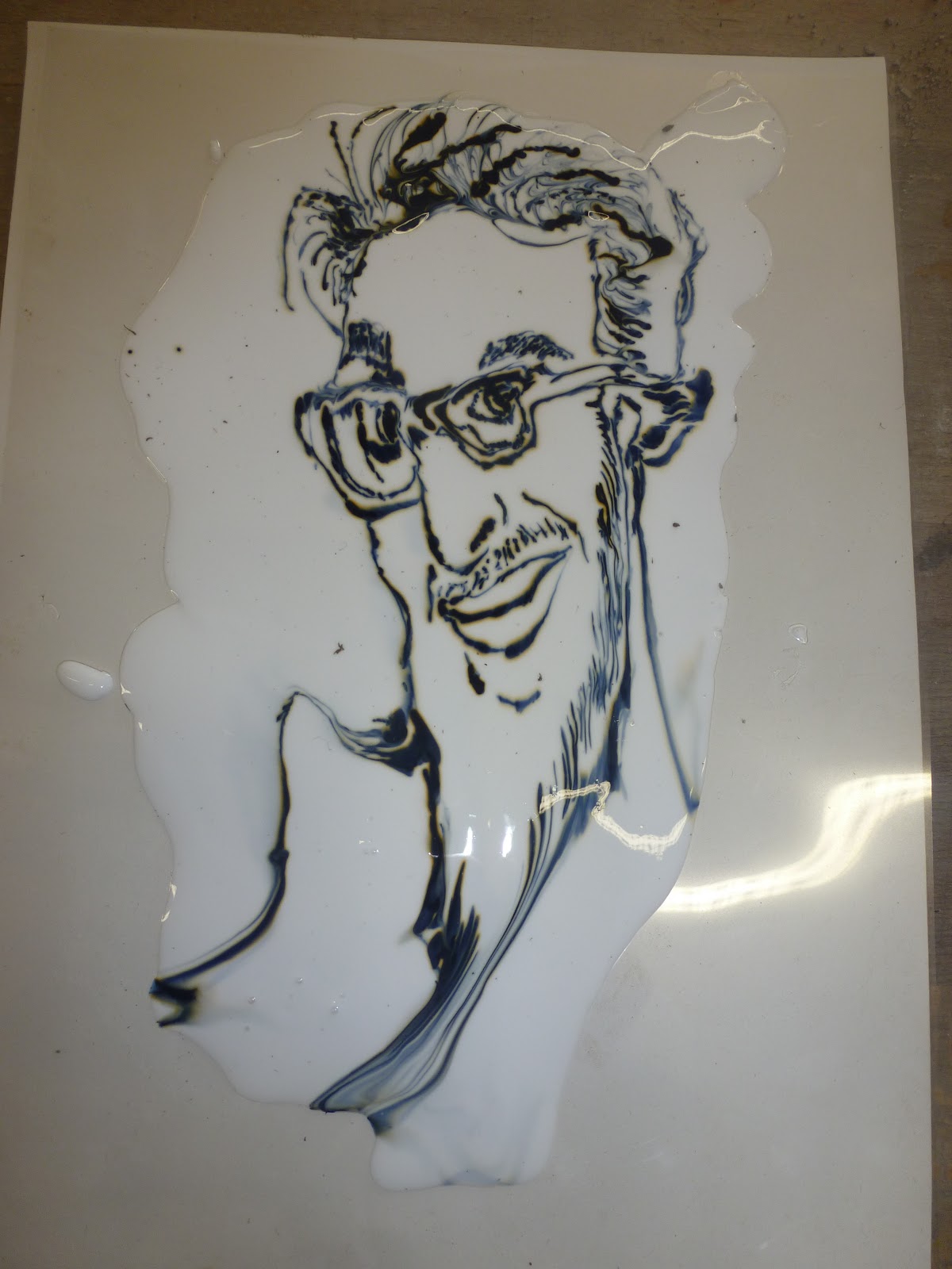
The P.V.A and ink sample shown here was another experiment to exaggerate and distort the face with the running ink and this outcome I think is successful at stretching a portrait and creating the cartoon style which is visually recognizable, I also enjoyed the simple technique for which I created the ink piece. The following images are photographs taken throughout the production of the p.v.a sample to show variations of exagerated areas and warped features. These I feel show the development and progression of this outcome well and am also pleased with the series of images.
The first image shown below was the starting point for which th p.v.a ink drawing was created, the drawing had to be a close representation of the photograph (shown top of post) in order to start realistic and gradually exaggerate.


Distortions


The image above is one of my favourites of the p.v.a series as it creates a strong representation of the caricature style with exagerated features such as the face shape, ears, jaw etc. It has also been said to me that this piece has the resemblance to the t.v presenter and entertainer Rolf Harris which I find humurous and is also a reason for me liking this sample.


Cellotape Transfer on background- Experiment to look at layering outcomes and combining techniques to further my mixed media skills.

Ink image printed on textural background, this outcome was to further my idea of layering surfaces to create more interesting textural samples.

I think the Impasto print shown above was successful and has an almost worn poster feel to it. This piece was to look at the idea again of removing surfaces to exaggerate the parts of the image that are left and i think this piece shows this idea well, and as the old saying goes... "Less is More!" But then I agree to disagree with that point.
Another Impasto print below and this was done on metal and was bent afterwards to create warped parts of the face when studied at different angles due to folds within the metal. At first i thought this was risky as it would be difficult to remove the folds in the metal if a mistake was made, despite this, I continued with it partly due to the project theme of "Risk" and the risk taking element involved in Art and Design, I also feel the piece proved to be successful.


The sample above shows a Stitched Text piece which was to look at the idea of text in images and emphasise the character through the repeated use of a word in stitch.
These clay drawings above were pieces I made to look at the use of "lines in cartoon art" and also hatching/crosshatching in drawing, the left tile I decided to show a more realistic looking portrait! but with features still emphasised and for the right hand piece, chose to exaggerate the features futher and show a more distinctive caricature style. I think the visual differences in these two pieces is very interesting despite it being of the same subject and for this reason I feel the two tiles were sucessful pieces overall.
Landscapes/Architecture

The response above was a typography piece in clay that I created towards the beginning of my project and was looking at aspects of sculpture, in particular the "Ramsbottom Urn" as I felt this was an unusual and interesting sculpture and would fit in well with my project.

Another clay tile I created using the inspiration of the "Ramsbottom Urn" and the Typography Style showing the letters which spell the word "Urn" pouring out of it, when studying this piece of work I think the subtlety of it is what I like most and the idea of it being an image with text rather than a recognizable piece for typography is most appealing.

This is a Monoprint of my local "lop-sided church," this I thought would be good to record as the
lop-sided-ness of the tower is clearly noticeable when observed, so creating an interesting perspective.

Another Monoprint depicting the landscape and the main road that leads into the town of Rawtenstall. The sketchy style I adopted on this print I really like and the decision to include the figures shadow at the bottom as this was my shadow when taking the photo I think adds to what could of been a regular landscape and fits in with the project idea of risk taking in order to create more diverse oucomes and I think the risk payed off here. Despite all this my favourite feature is actually the fence as the bold lines create the eye catching point for the viewer and so creates a sense of looking through the image.
The etching shown below was my first propper attempt with the scraper board medium, and from creating this landscape, I feel is something I am going to pursue as the variations of marks that can be created to show detail, texture and life I find amazing. The aspect of creating samples that give off this sense of life and expression when studied I think is very intriguing and could say that it is my sort of trademark with my art, but is something that has been done over and over when thinking of movements like Impressionism, this movement in particular is one of my favourites, but I digress.
